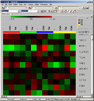
visualising intensities / ratios
of the expression matrix.
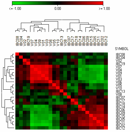
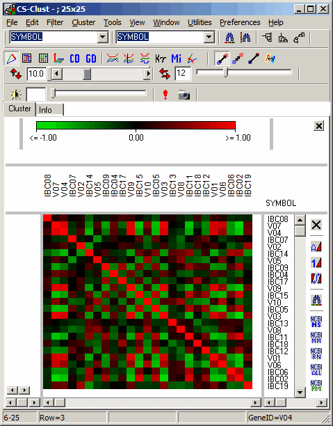
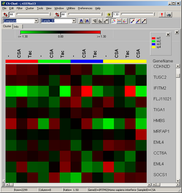
The famous red-green heat maps
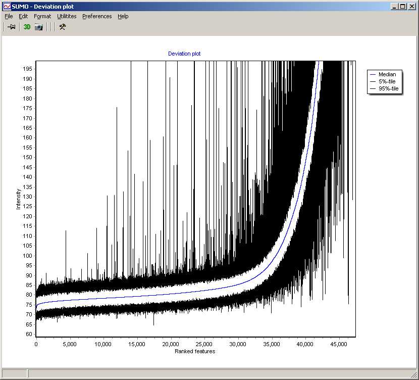
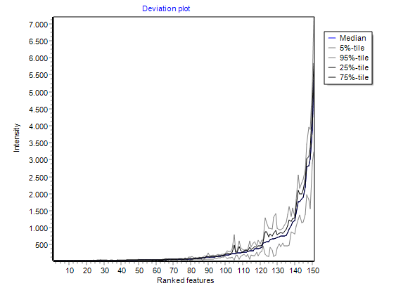
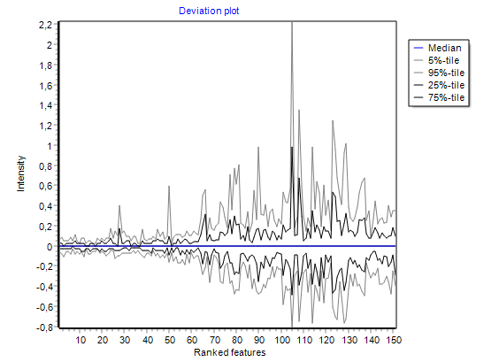
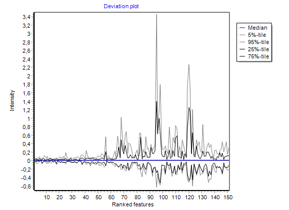
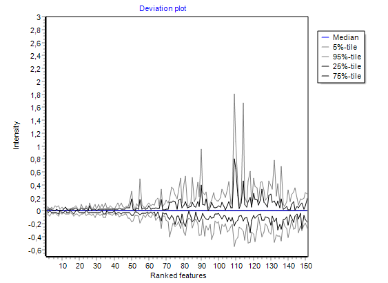
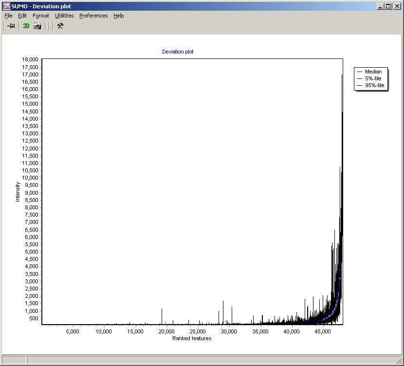
summarizing global intensity/ratio distribution
in all hybridisations
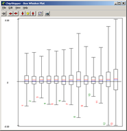
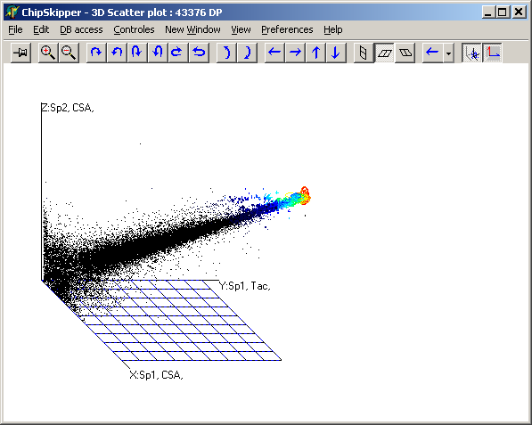
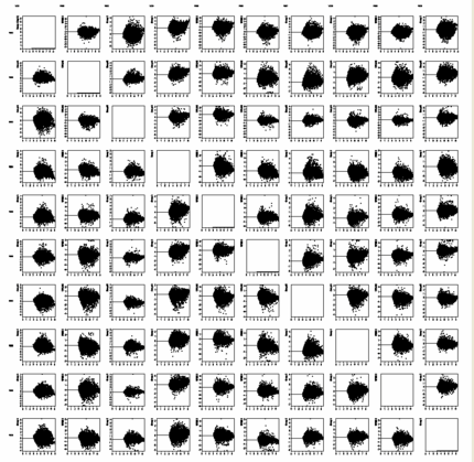
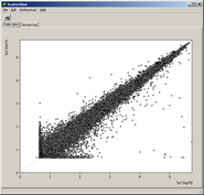
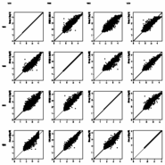
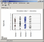
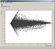
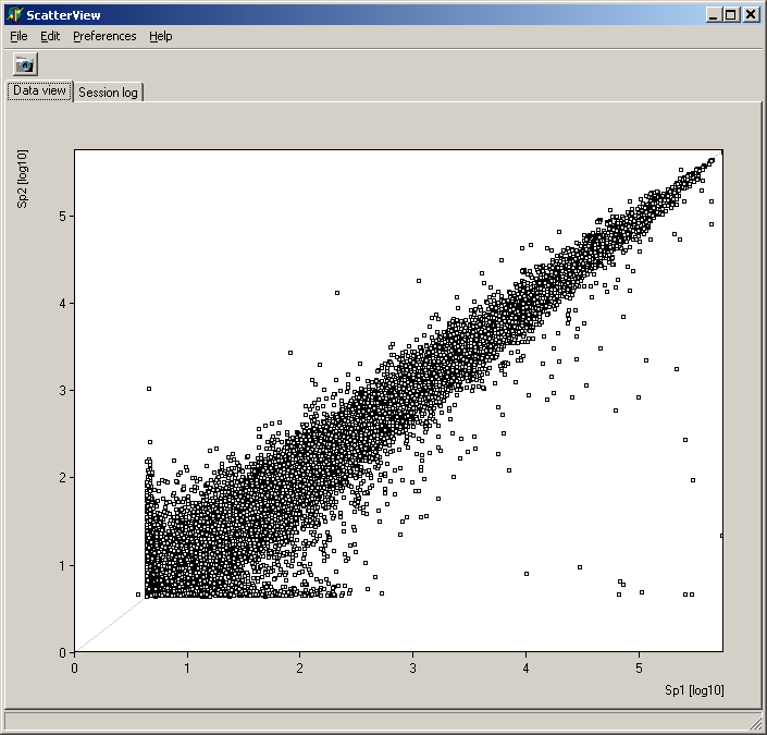
Analyze pair wise signal distributions
See more details about the scatterplot viewer.
of hybridisations
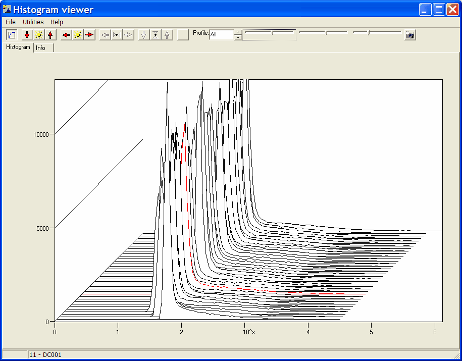
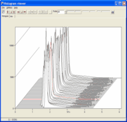
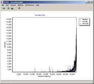
Get an overview of signal distributions
in all your sample data
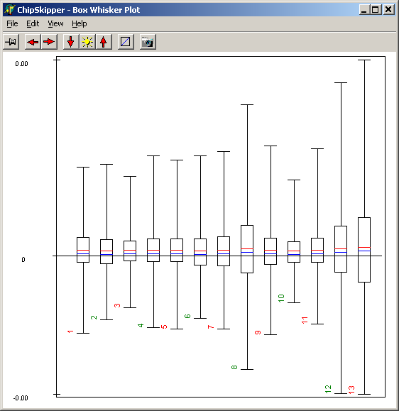
Show signal distribution in any
or all loaded samples
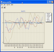
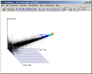
Illustrating e.g. gene/sample
data profiles
Illustrating inter-sample
similarity
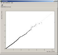

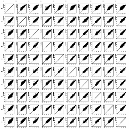
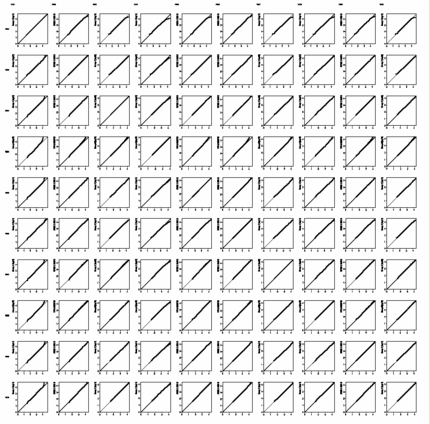
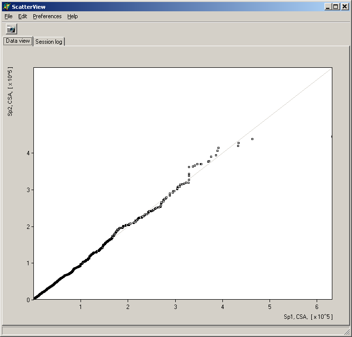 See more details about the Scatterplot viewer