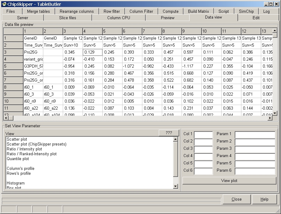
Create different graphical views of data.
Click the desired column in the Data file preview grid, then the corresponding column edit field (Col1..Col6). Or enter a regular expression for selection of multiple columns in edit field Col1 (e.g. 3..10) for multiple columns.
Select the graph from the View list and click the View plot button. When multiple graphs will be generated (e.g. multiple files or columns selected for scatterplots) the graphs are dynamically generated and save into a MS Word or PDF file.
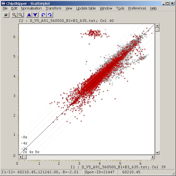
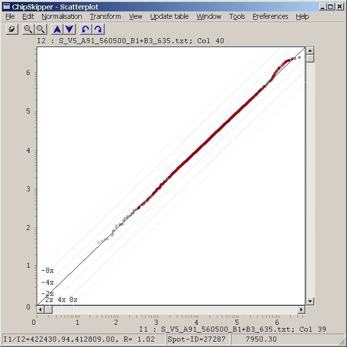
Scatterplots: Create various scatterplot.
Scatterplot : conventional scatterplot:
X-Axes: values form data column specified in COL1
Y-Axes: values form data column specified in COL2
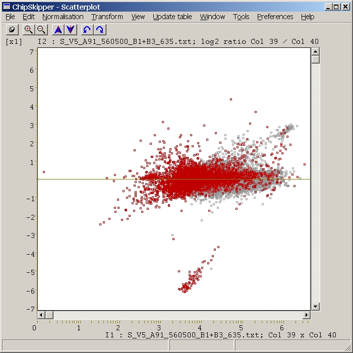
Ratio / Intensity plot ( also called R/I or M/A plots)
X-Axes: Product of values from data columns specified in COL1 adn COL2 edit
field.
Y-Axes: Ratio of values from data columns specified in COL1 adn COL2 edit field.
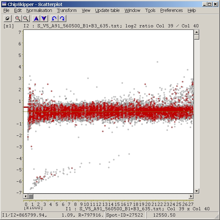
Ratio / Ranked intensity plot
X-Axes: Sorted (from lowest=left to highest=right) Product of values from
data columns specified in COL! adn COL2 edit field.
Y-Axes: Ratio of values from data columns specified in COL1 adn COL2 edit field.
Qunatile plot
X-Axes: Sorted values from data column specified in COL1 edit field.
Y-Axes: Sorted values from data column specified in COL2 edit field.
Profiles - Line graph of columns or rows
Values from data column specified in COL1 edit field are displayed as a
simple line graph. Red / blue horizontal lines represent Mean-average and SDev.
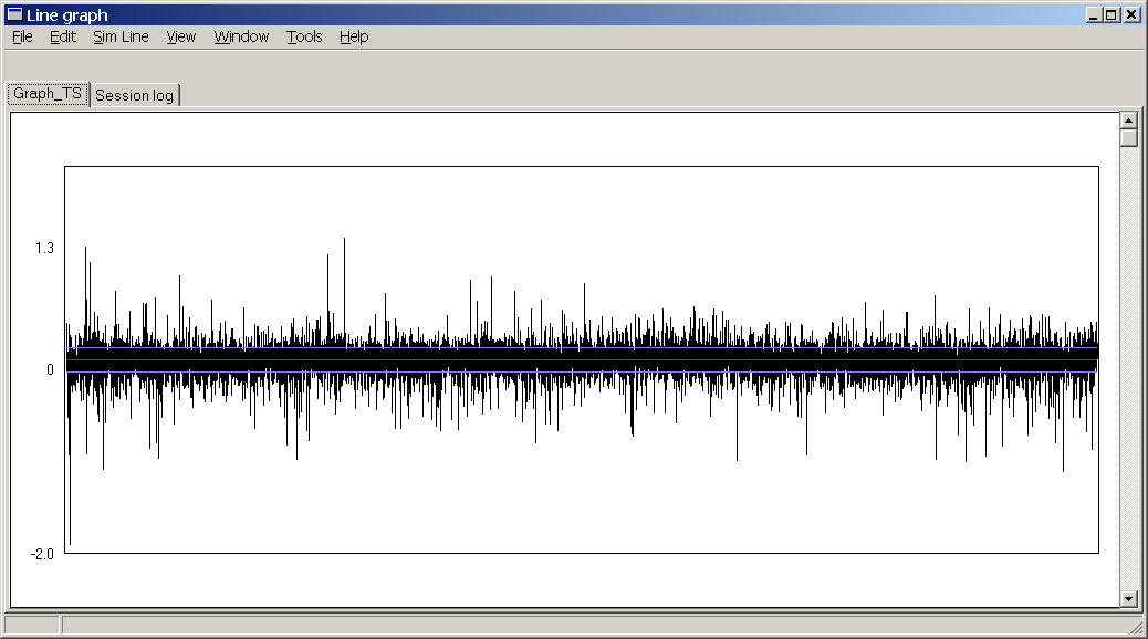
e.g. a expression profile of all genes (~25000) from a single hyb.
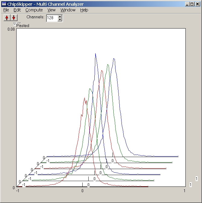
Multiple Histograms
Heat maps (Eisengrams)
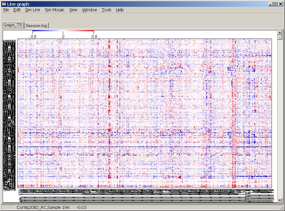
Here 295 Hybs x ~500 genes are shown.
Last edited 10.06.2005,