Customize the chart
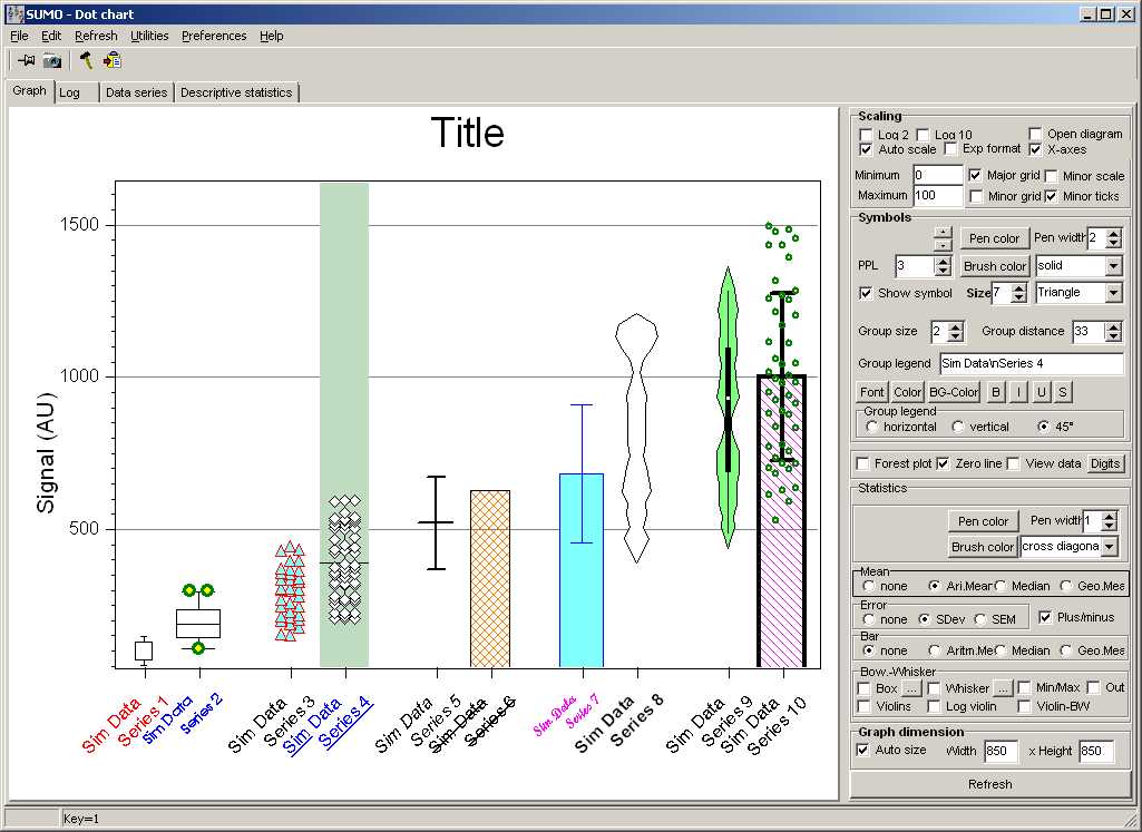
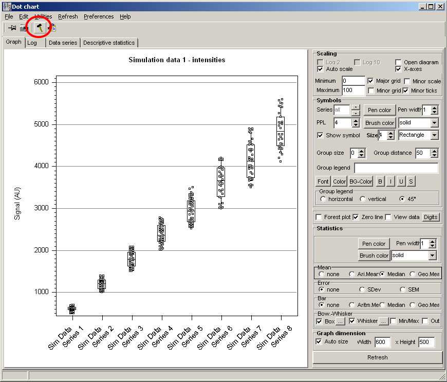
To customize the chart view, open/close the tool box by Clicking the "Hammer/Tool" button:

Now you may customize seleted data series idividually or all together:
Scaling

With Autoscale checked, DotChart finds Minimum/Maximum values from all loaded data series
and adjusts Y-axis accordingly.
Un-check Autoscale and define Minimum / Maximum manually.
Show / Hide Major grid / Minor grid / Minor Scale / Minor ticks by checking the respective fields.
Select series
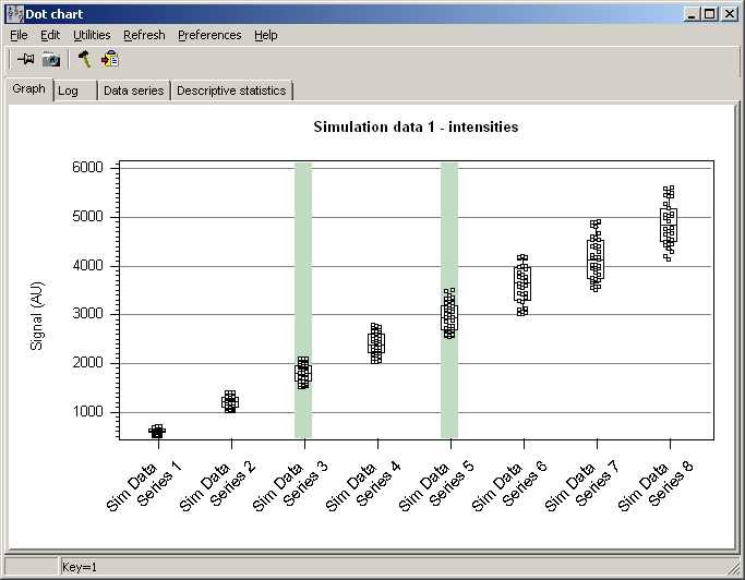
To select a single series just click with the mouse into the series.
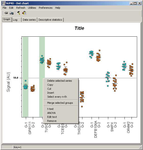
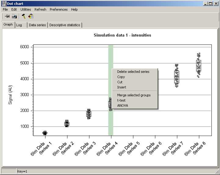
The selected series will be shown on green hghlighted background:

To select multiple series, keep Ctrl-Key pressed when clicking multiple series.
To select a range, click first series, next last series keeping Shift-Key pressed.
Any subsequent operation with a series, will be applied to all selected series.
If nothing is selected, DotChart assumes you want to modify all series.
Arrange series
You may freely reorder the displayed data series.
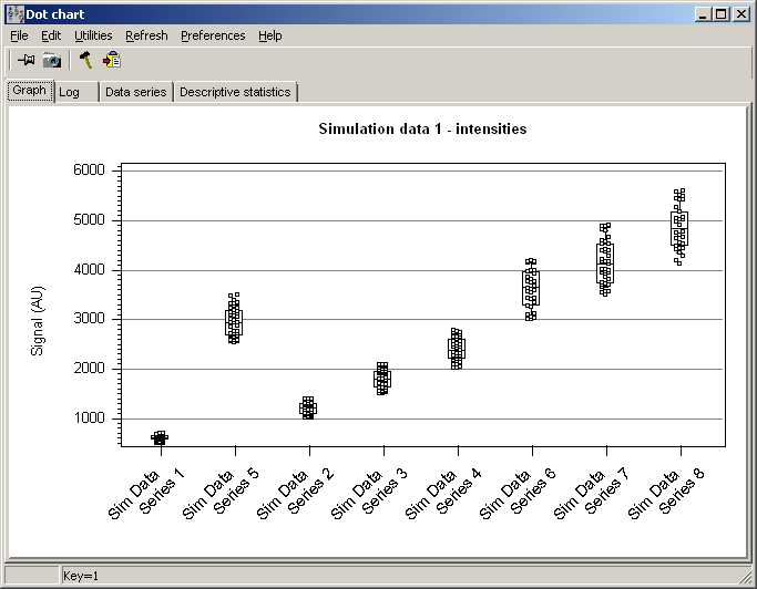
Click into a series, and drag it with pressed left mouse button somewhere within the chart.
The selected series will be dropped in front of the series where you release left mouse button.
E.g. Series-5 dragged preceeding Series-2:

Copy / Paste / Delete series
Click with right mouse buttn into a series.
A context menu opens up:

- Delete all selected series
- Copy the selected sereis
- Insert a copied series in front of the selected series.
This works even across different DotCharts.
- Cut: Copy the series, then delete it.
Data symbols
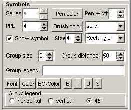
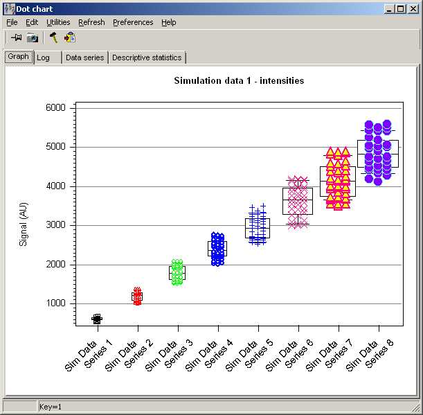
Data symbols in the different groups may have individual style:

- Symbol type: Rectangle/circle/triangle/diamond/...
- Size
- Pen color for symbol's border
- Pen width for symbol's border
- Brush color to fill a symbol
- Brush style to fill a symbol: Solid/dashed/... (only for really big symbols)
- PPL: number of point rows within a series
- Show symbol: Show/Hide the respective groups' symbol for each data point.
- Group size: Display the respective number of groups closer together, leaving a larger gap between groups.
- Group distance: Define the gap between series'-groups.
- Series' legend font: Define Font face/Color/Background color/Bold/Italic/Underline/Strike-out for the selected series' legend
- Series legend Orientation

Select one or multiple series.
All modifications are aplied to all selected series.
If no series are selected, all are modified.
Statistics
Beneath the date itself, DotChart may indicate addtionally - or only - statistical indicators.
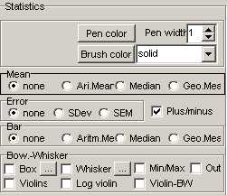
In the toolbox use the Statistics options to adopt the chart:

Show either indiviual or in any combination:
- Mean line: either as Arithmetic/Median/Geomertic mean.
- Error of mean: either as SDev from Arithmetic/Median or Geometric mean
Standard Deviation (SDev) or Standard Error of Mean (SEM).
Select a mean value first, to be able to indicate an error
Plus/Minus: show error as bi-directional indicator, or only on top (mean>0)
or below (mean<0) the mean indicator.
- Bar: From Zero line to Arithmetic/Median/Geometric mean.
To indicate the error, also check the respective Mean/Error checkbox.
- Box-Wisker plot: Box/Wisker/Outliers (data smaller/larger Wisker)
By default:
- 25%-75% Quantiles are indicated by the box
- 5%-95% Quantiles are indicated by the Wisker
Click the "..." Buttons to adjust quantile ranges for Box/Wisker
Out to show the outliers (those data outside the Wihsker)
- Violins
indicate the probability density distribution of the data series (in y-dimension) symmetrically on both sides.
Additonally, you may view a Box-Whisker in the centre of the violin.
- Log-Violin: Show the distribution with log-transfomed density.
- Violin-BW: Viwew a Box-Whisker Plot in the centre of the Violin.
The "dot" in the centre of the Violin-BW indicates the Median.
To create a "smooth" distribution in the Violins, the number of histogram channels is adjusted
according to the data series' size. Furthermore, the resulting distribution is "smoothed".
- Pen color for means/sdev/Wisker/border of bar/box
- Pen width
- Brush color for bar/box
- Brush style for bar/box
The width of the statistic elements follows the width of a data series and may be influenced by adjusting the PPL and Size fields.
As with any other statistical analysis, conclusions should only be drawn from data series with large enough sample size.
Parameters are applied to the selected groups.
Graphical settings may differ from the settings for respective series' symbols.
If no series are selected, modifications are applied to all series.

Group tests
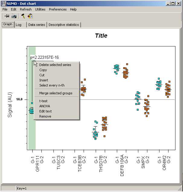
To perform group tests, select 2 or more individual data series.
Click with right-mouse button into any of the selecdted series.
From context menu select:
- t-test for 2 groups
- ANOVA for 3 or more groups
to test, whether the selected series share the same gaussian distribution.

A input dialog opens up.
Here, you may define the text dsplayed on top of the test indicator in the graph.
By default, the p-value in scientific format is used:

Change the text any way you prefer and click OK button.
Click Cancel button to abandon the test.
Edit "text" of a test
Click the bracket, close to the first series of a group test with right mouse button:

From context menu select Edit to change the text displayed.
Select Remove to remove the selected "test" from the chart.
Adjust bracket
You may adjust the horizontal connector of a test's bracket:
Click the bracket, close to the first series of a group test.
Keep left mouse button clicked and move the connector - and the text - up/down.
Forest plot
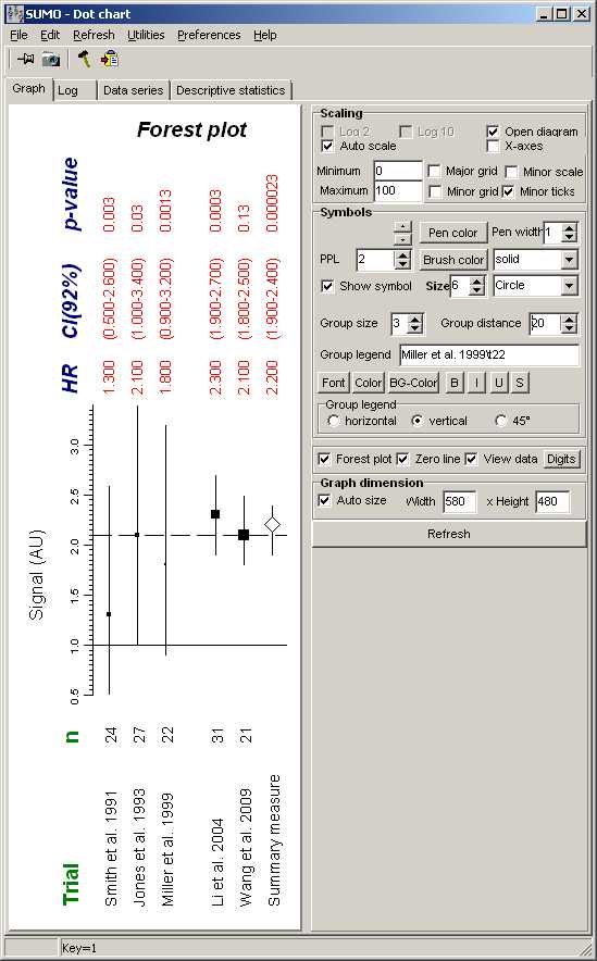
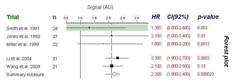
DotChart may be used to generate forest plots.
Forest plots are used to view e.g. results from Cox-regressions - as with SUMO's cox regression tool.

To view hazard ratio(confidence interval/p-vlaue check View data field.
Click with right mouse button into a chart area.
From context menu you may change Text and Font of the respective item.
Adjust the distance between the data field (top of graph) or Series names (bottom of graph) by defining tab distances.
(Dotchart | Main menu | Preferences | Tabstops)
For the example picture Top tabs area adjusted to "10,50,150" pixel,
Bottom tabs to "120,50,20" pixel.
Tabs in series names are entered as "\t" (e.g. "Smith et al. 1991\t24").
The gap after after trial-3 ("miller et al.) is generated by:
- define: Group size=3
i.e. each 3 series form a group
- define: Group distance=20 pixel
i.e. a 20-pixel gap after each group of 3 series
Copy / Paste forest plot data
You may import data as multiline tab delimited data from clipboard.
Prepare a muliline text:
- One line per series
In each line TAB-delimited:
- Name (internal tabs coded as "\t")
- hazard ratio
- lower confidence interval value
- upper confidence interval value
- p-value
Copy the text to clipboard and paste it into DotChart:
(Dotchart | Main menu | Edit | Forest plot | Paste data).
Snapshot
Click the Camera-toolbar-button to capture the chart image.
The picture is automatically rotated 90° clockwise.

Legends / Title
Chart size
Size of the chart is automatically adjusted fo fil the DotChart window.
But it may be convenient to define a fix cahrt size when assembling a complex figure with muliplt dotcharts.
