| "\x≥nnnn.nn" | all objects where X-valiue is equal or larger specified threshold |
| "\x≤nnnn.nn" | all objects where X-valiue is equal or smaller specified threshold |
| "\y≥nnnn.nn" | all objects where Y-valiue is equal or larger specified threshold |
| "\y≤nnnn.nn" | all objects where Y-valiue is equal or smaller specified threshold |
| "\s≥nnnn.nn" | all objects where size-value is equal or larger specified threshold |
| "\s≤nnnn.nn" | all objects where size-value is equal or smaller specified threshold |
| "\c≥nnnn.nn" | all objects where color-value is equal or larger specified threshold |
| "\c≤nnnn.nn" | all objects where color-value is equal or smaller specified threshold |
| "\r≥nnnn.nn" | all objects where RATIO x/y≥specified threshold |
| "\r≤nnnn.nn" | all objects where RATIO x/y≤specified threshold |
| "\lr≥nnnn.nn" | all objects where RATIO log2(x/y)≥specified threshold |
| "\lr≤nnnn.nn" | all objects where RATIO log2(x/y)≤specified threshold |
X	            Y	            Error-X	    Error-Y	    Size	    Color	   Group	Name
128546.48438	115674.15625	1820.84790	11942.00098	34.01107	39.77178	0	    1
 30870.58594	133569.12500	2894.34741	13599.37695	 3.44957	 9.55785	0	    2
-41971.60938	-54666.37500	3154.14136	 5431.87061	 6.53209	 3.38831	0	    3
-34792.36719	-68183.10938	3170.89355	 2756.95752	58.64328	63.78699	0	    4
-18017.51563	-98872.61719	1449.07239	 8313.46094	25.48250	19.61693	0	    5
 96628.62500	 42455.34375	 576.08539	 3467.49487	 2.25695	75.79591	0	    6
 ...
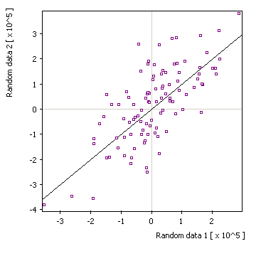
| Default display: |
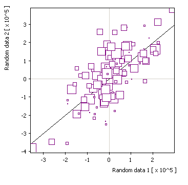
x/y + size: |
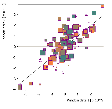
| x/y + size/color: |
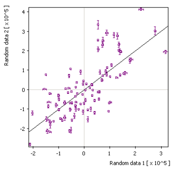
x/y + error: |
Symbols: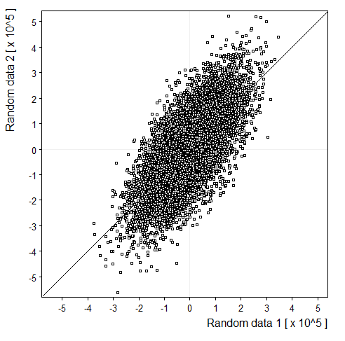 |
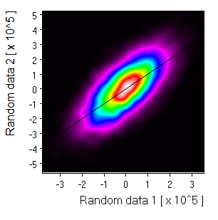
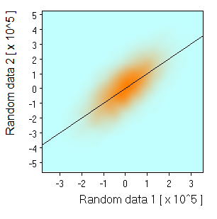
Density map: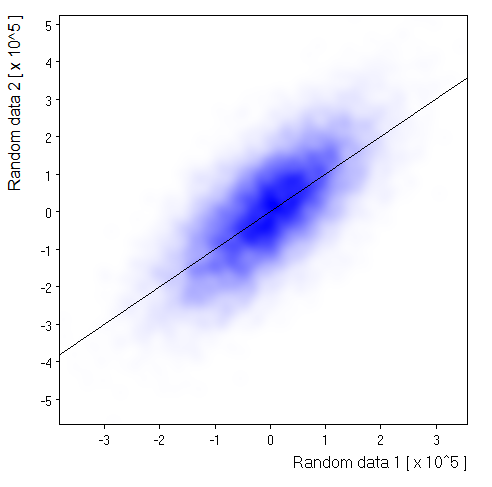 |
Monochrome: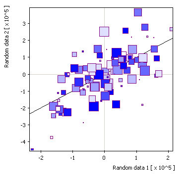 |
2-Color: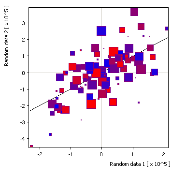 |
3-color: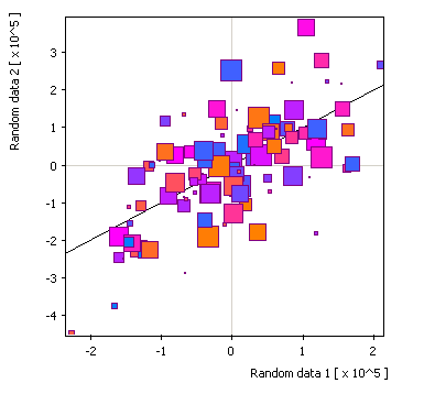 |
Direct line: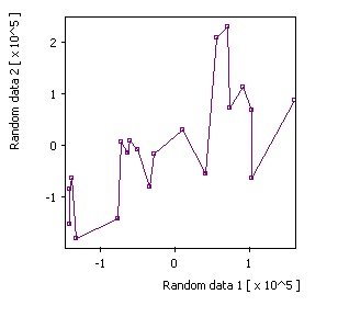 |
Right step: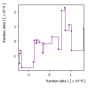 |
Left step: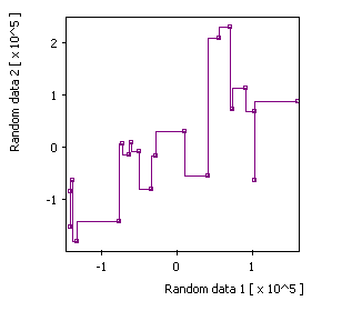 |
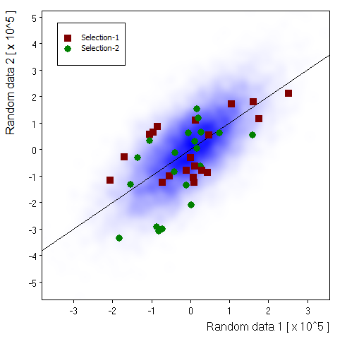
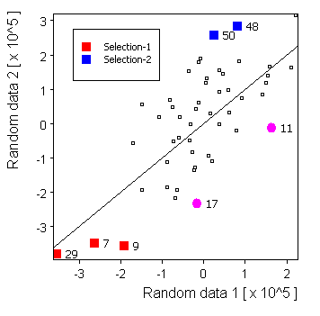
Selected source: |
Replica 2: |
Replica 3: |
Linear: |
Gaussian: |
Half circle: |
Waves: |
| Size=11,Sdev=2,Linear: | 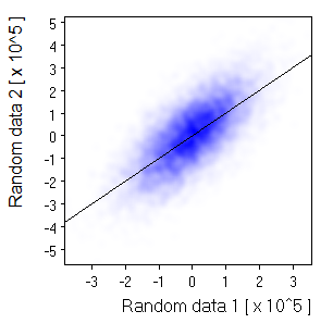 | |
| Size=21,Sdev=4,Linear: |  Nice and smooth for a small picture. But not if you expand the image | |
| Size=91,Sdev=10,Linear: | 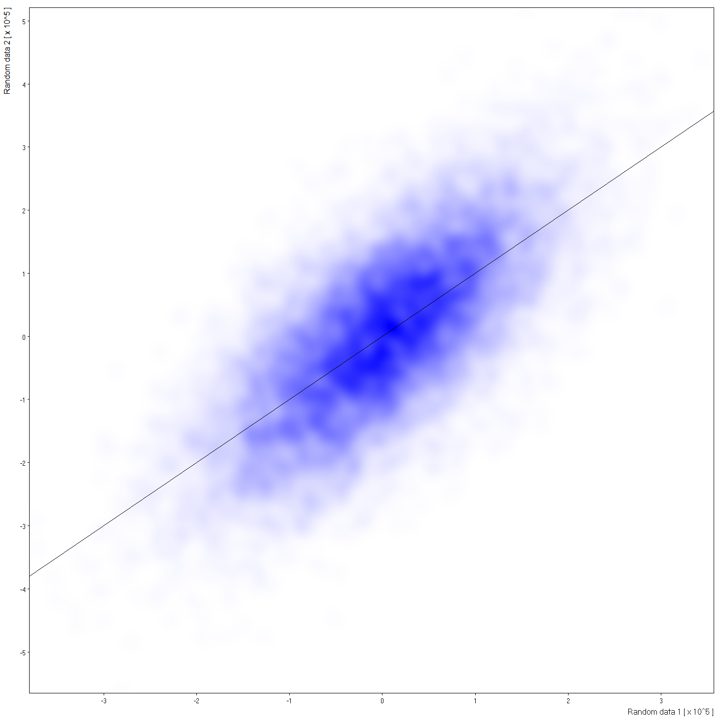 Click to see large view. | |
| Size=21,Sdev=7,Linear: | 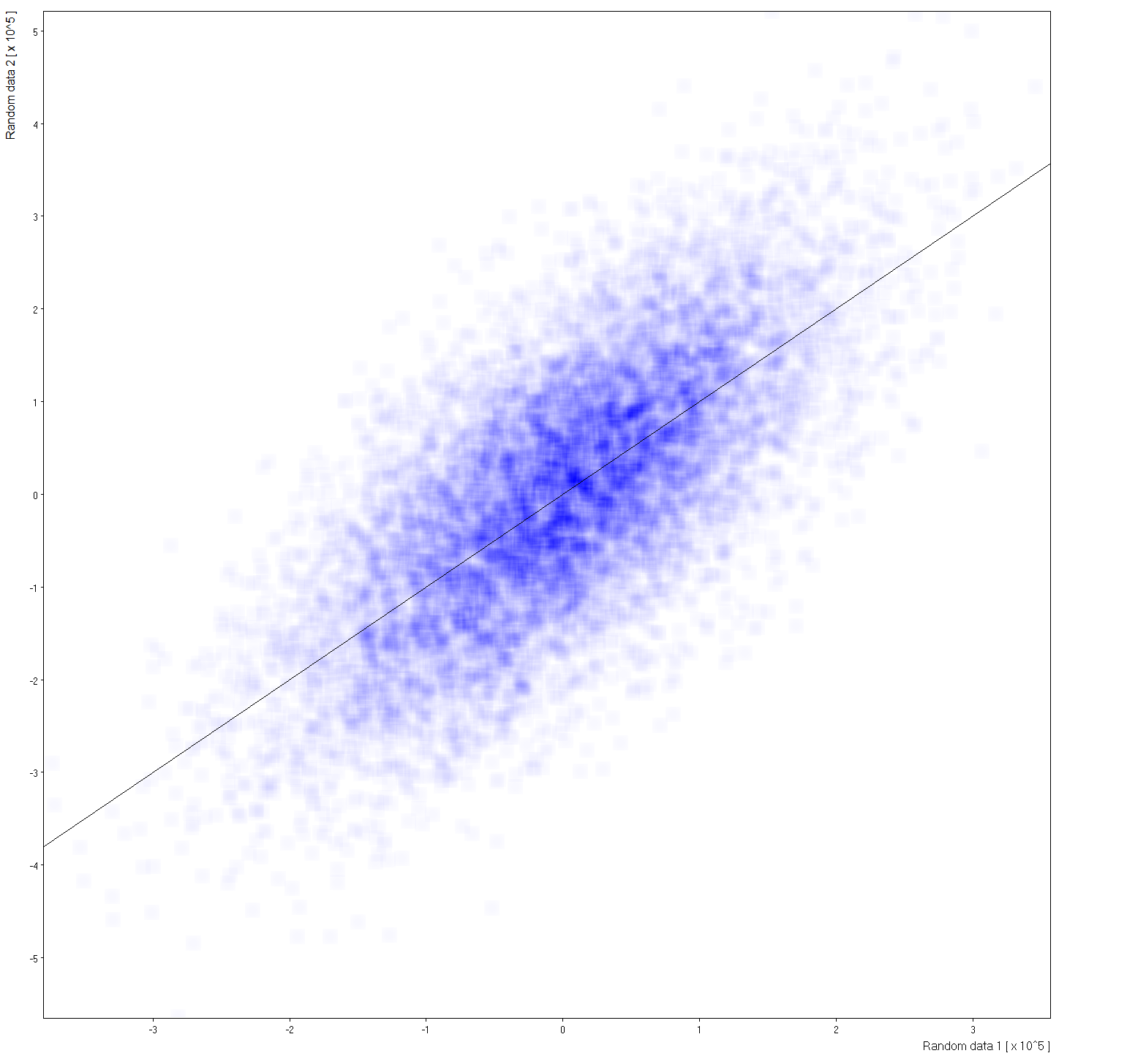 Gaussan profile to wide for computation kernel. Click to see large view. |
White=>Blue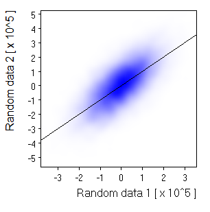 |
White=>Red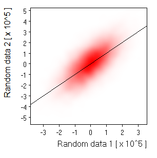 |
White=>Green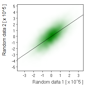 |